排出量データを扱う上で、可視化は常に最も重要な要素の一つでした。よく設計されたダッシュボードは、数ヶ月にわたる活動データを、チームが行動を起こせるストーリーに、そしてステークホルダーが容易に理解できるものに変えることができます。
しかし、サステナビリティチームはそれぞれ、データを扱う方法が少しずつ異なります。事業部門間で排出量を比較する必要があるチームもあれば、複数の報告年度にわたる施設レベルの傾向を追跡したいチームもあります。レポーティングチームは、スコープと計算の詳細を含むカスタムビューを必要とします。経営幹部は、取締役会に持ち込める簡潔な要約を求めています。報告サイクル、監査、ステークホルダーとの対話はどれも全く同じではなく、デフォルトのビューがすべての質問に答えることはめったにありません。
だからこそ、私たちは構築しました 強化されたダッシュボード、Persefoniに内蔵されたネイティブのダッシュボードビルダーです。これにより、チームは排出量データの完全にカスタマイズされたビューを、特定の質問、対象者、または報告のタイミングに合わせて柔軟に作成できます。

排出量データのために構築されたカスタムダッシュボードビルダー
Persefoniの標準分析機能は、すでにサステナビリティチームに炭素インベントリを理解するための強力な基盤を提供しています。強化されたダッシュボードは、さらに一歩踏み込み、プラットフォームを離れることなく、独自のビューを構築、設定、共有するためのツールをチームに提供します。エクスポートも、サードパーティのBIツールも、手作業による回避策も不要です。
複数のダッシュボードを作成し、タブで整理できます。さまざまな可視化タイプ(テーブル、棒グラフ、円グラフ、面グラフ、ツリーマップなど)から選択し、ダッシュボードレベルと個々の可視化レベルの両方でフィルターを設定できます。構築されたダッシュボードは、プレゼンテーション、報告サイクル、または継続的な監視のために社内で共有できます。
ビルダーで利用可能なデータ属性は、CO2e活動台帳から直接取得され、排出量、エネルギー、取引データ、GRIに準拠した廃棄物および水に関する指標などが含まれます。つまり、作成するすべてのダッシュボードは、Persefoniで既に管理されている、信頼性が高く監査対応済みのデータに基づいています。
構築できるもの
強化されたダッシュボードは、サステナビリティチームが既に行っている作業に合わせて柔軟に対応できるように設計されています。Persefoniのお客様が現在構築しているものの例をいくつかご紹介します。
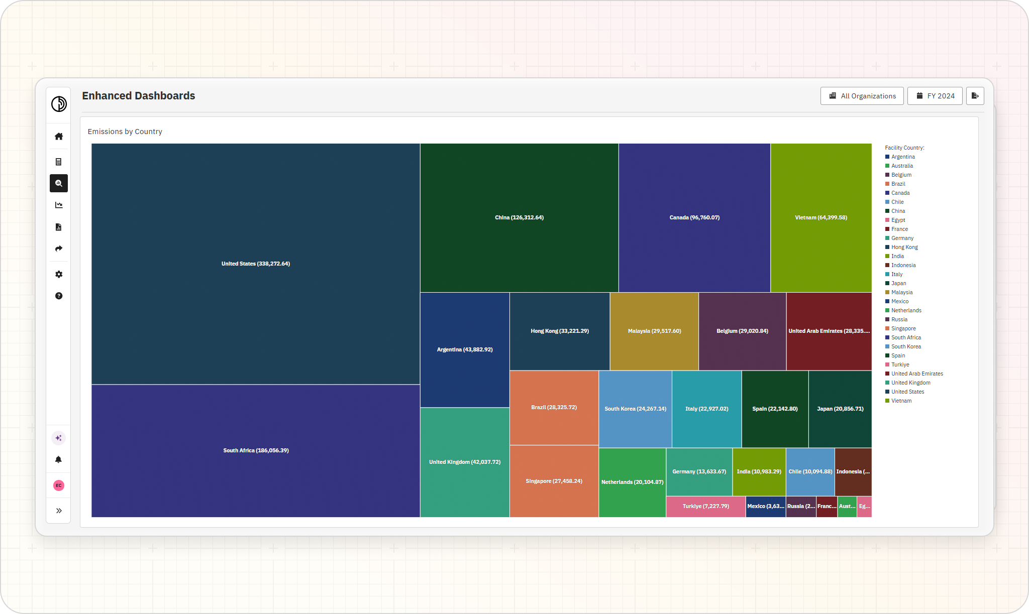
国別排出量: ツリーマップとして可視化され、グローバルなフットプリント全体で、どの施設や地域が最も大きな影響を与えているかを素早く確認できます。
月別およびフットプリント源別エネルギー消費量: スコープ別に分類され、報告年度全体の傾向を追跡し、季節的または運用上のパターンを明らかにします。
前年比排出量テーブル: 算定範囲と計算方法の詳細を盛り込み、内部チェック、差異分析、監査準備をサポートします。
報告年度間の施設レベル比較: 外れ値の特定、削減進捗の検証、報告期限前に詳細な確認が必要なサイトの特定に役立ちます。
主要機能
強化されたダッシュボードは、データに最も近いチームがより多くの分析制御を直接行えるように設計されています。
主要機能は以下の通りです:
ドラッグ&ドロップ式のダッシュボードビルダー: SQLやBIの経験がなくても、ダッシュボードを視覚的に構築できます。可視化タイプをキャンバスにドラッグし、それぞれを個別に設定してください。
ダッシュボードレベルおよび可視化レベルのフィルター: トップレベルのフィルター(報告年度、算定範囲の会計方法、組織階層)を一度設定すれば、個々の可視化にさらにフィルターを重ねて、同じページでグローバルビューと国別ビューを並べて表示できます。
複数の可視化タイプ: テーブル、棒グラフ、円グラフ、面グラフ、ツリーマップなど、質問に合わせて最適な形式を選択できます。
Persefoniプラットフォームにネイティブ対応: ダッシュボードは「分析」セクションに標準ビューと並んで表示され、いつでも更新、複製、再編成が可能です。エクスポート、同期、サードパーティツールの保守は一切不要です。
チームのための共有ワークスペース: ダッシュボードは、プレゼンテーション、報告サイクル、継続的なモニタリングのために社内で共有でき、全員が同じ信頼できる情報源に基づいて作業できます。

カスタム分析で炭素会計ワークフローを強化
炭素データは単なる数字ではありません。それは、組織がどのように運営されているか、影響がどこに集中しているか、そしてどこで進捗が見られるかの記録です。チームがそのデータと柔軟にやり取りできるほど、より多くの価値を引き出すことができます。
強化されたダッシュボードは、Persefoniで既に管理されている排出量データでチームができることを拡張し、質問から明確で共有可能な答えへと移行しやすくします。監査の準備、リーダーシップチームへの説明、事業部門間のパフォーマンス比較、あるいは単に前年比の変化の要因を理解しようとしている場合など、その瞬間に合ったビューを構築できます。
強化されたダッシュボードは、Persefoni Advancedで現在ご利用いただけます。 個別説明会を予約する カスタムビューが排出量分析をいかに強化し、チームが既存データを最大限に活用できるよう支援するかをご確認ください。
.png)